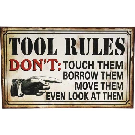
Tin Sign - Tool Rules
The message on the Tin Sign - Tool Rules is pretty straightforward and doesn't take much to understand and digest. They may come across as amusing or demanding, depending on how the onlooker wishes to interpret it. The design of the tin sign will pretty much match the rugged atmosphere of a blue-collar workplace.
The edges of the sign have a rustic appearance which is a common sight in shops with mechanical tools. The letterings vary in sizes and types, offering a great contrast to each other. The big red "DON'T" on the sign give a commanding impression to the reader.
The most eye-catching feature of the sign would be the hand picture with the finger pointing to the outlined rules, calling every reader's attention to read the sign and its contents.


